PRO~PT had just gone through a website redesign—but the results felt off, and they couldn’t figure out why. When they came to A&H and went through our brand discovery process, we were quickly able to identify that the website did not accurately represent their brand, so we went to work creating something new that would be authentic and effective for users.
Old Brand
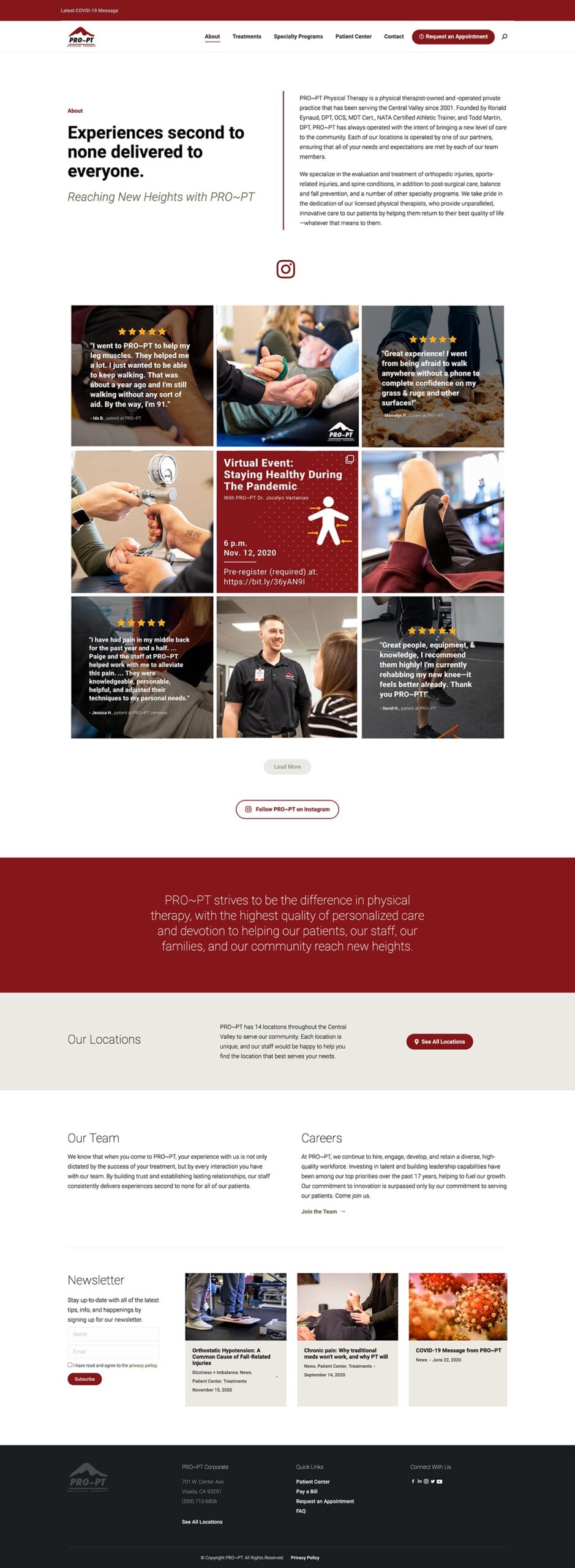
Re-aligning the Brand


New Brand
")
PUTTING THE PLAN INTO ACTION
With clear brand guidelines, a new color palette based on their logo, and a cohesive plan for the user experience, our team created a site that would clearly catalog all of PRO~PT’s treatment options and unique services while also guiding new and returning patients to the most relevant pages for them.
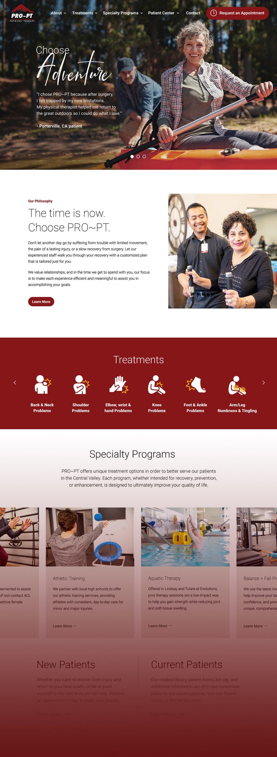
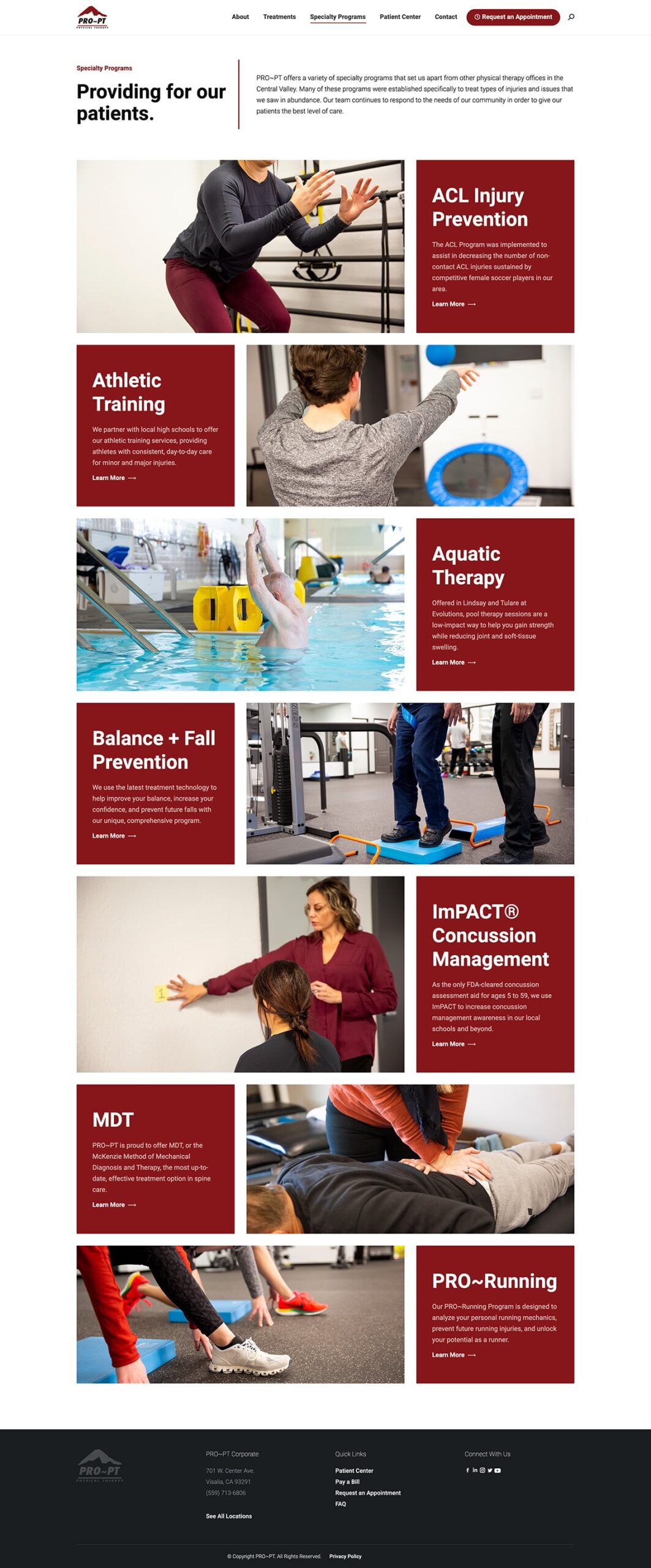
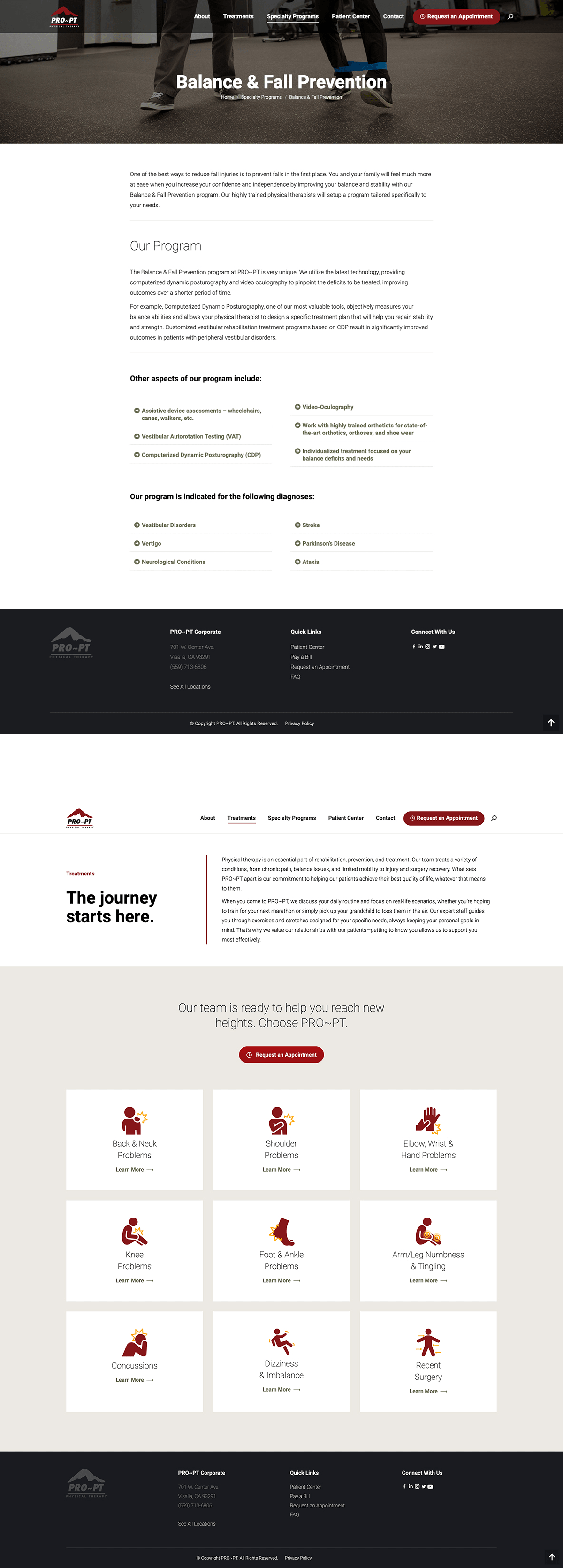

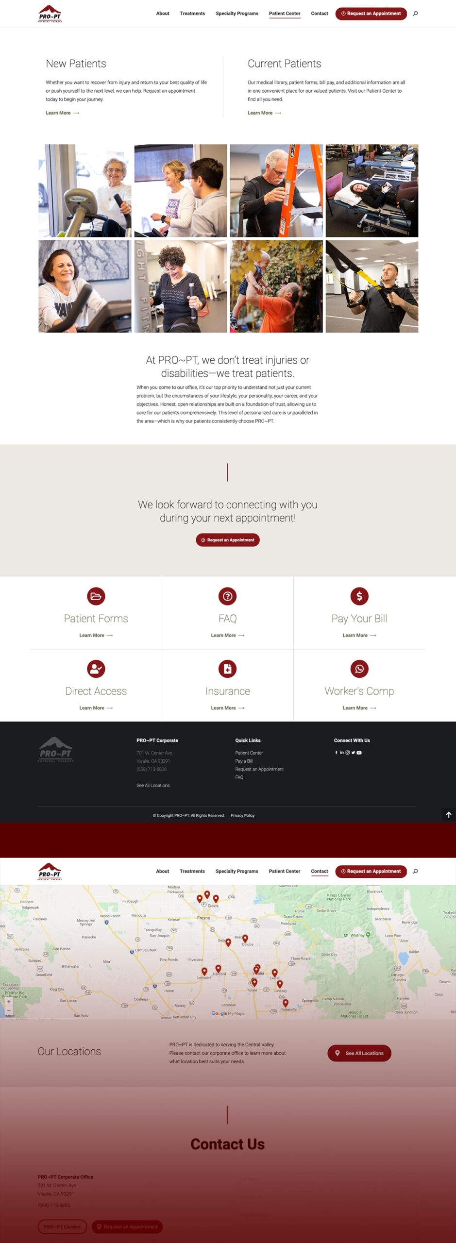
Custom Iconography

Photography


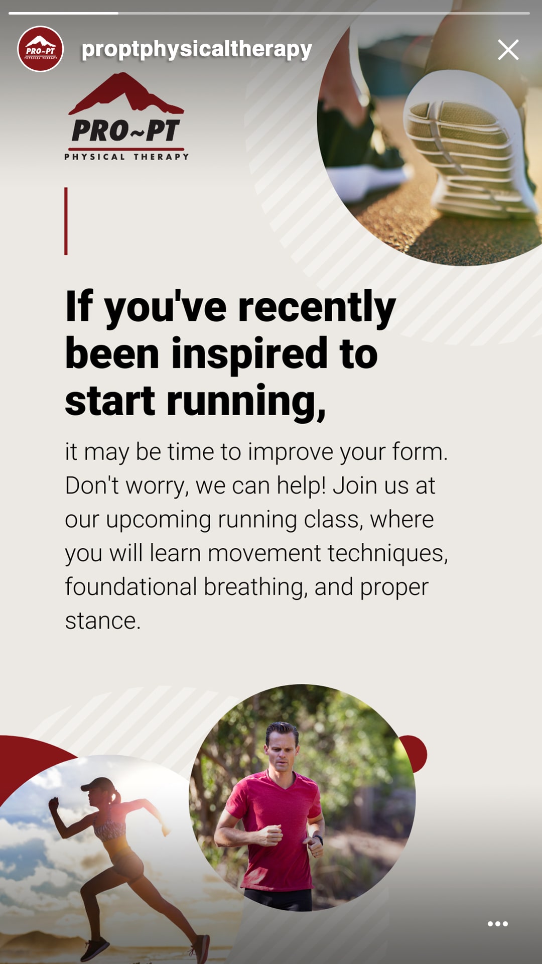
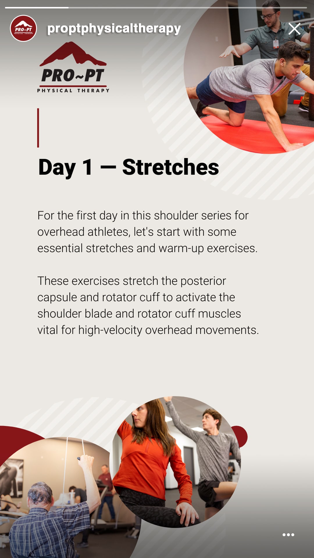
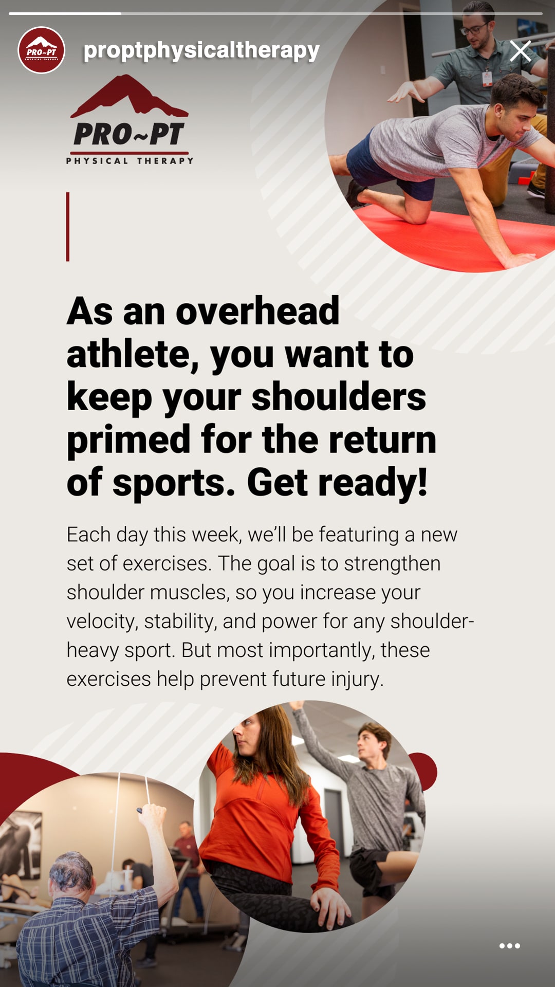
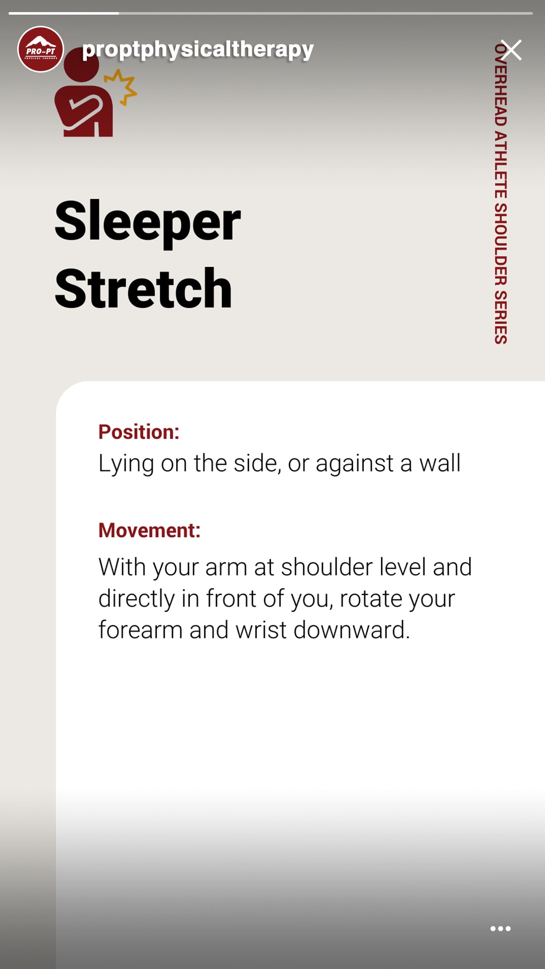
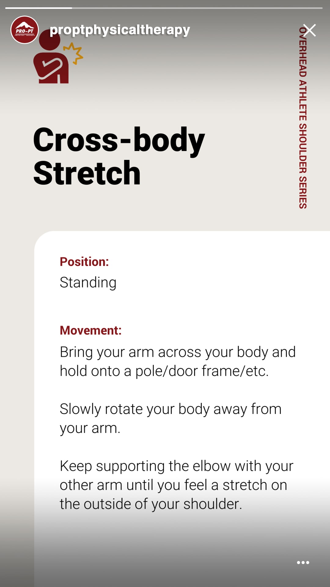
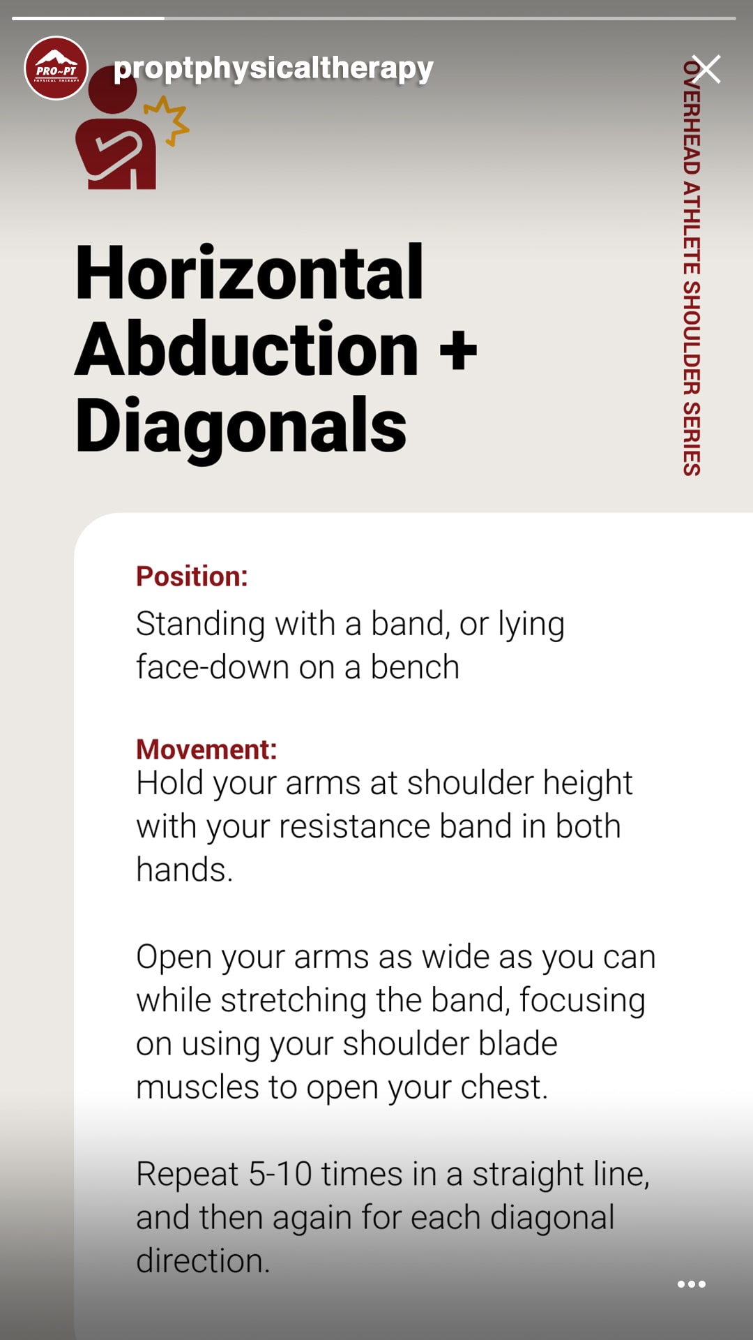
Social Media
& SEM Ads
We also began handling their social media management and advertising, making sure to keep their brand consistent across all platforms.


As a result of these new assets, along with our precise goals and ongoing trackable metrics, PRO~PT is receiving more appointment requests than ever before and effectively connecting with and helping patients across the Central Valley.
Share
Or check out a few more of our Projects.